Choosing the right light color is tough. The wrong one can ruin a project's mood. Understanding the psychology of warm versus daylight tones is the key to getting it right every time.
The key difference is emotional. Warm white light (2700K-3500K) feels cozy and secure, perfect for homes and gardens. Daylight (5000K-6500K) feels energizing and modern, making it ideal for public squares and contemporary buildings. Your choice shapes the space's entire psychological atmosphere.
I've seen firsthand how color temperature can make or break a project. It's more than just a number on a spec sheet; it's an invisible building material that shapes our feelings. But how do you apply this knowledge in the real world? Let's break down the specific effects and applications of each type of light.
What makes warm white light feel so comforting?
Trying to make a space feel welcoming? Standard lighting can feel cold and uninviting. The secret is warm white light, which creates an instant sense of comfort and safety.
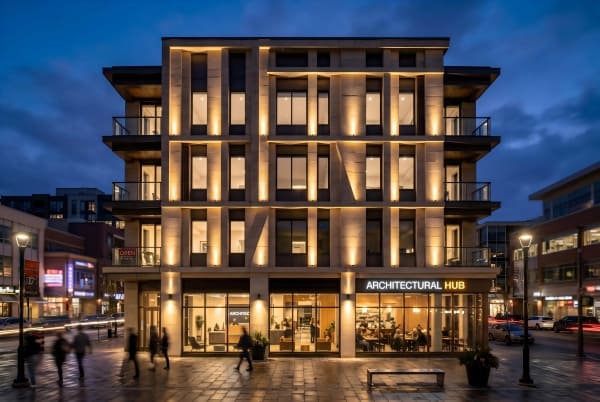
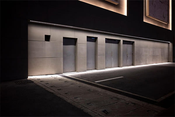
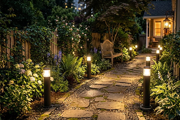
Warm white light (2700K-3500K) feels comforting because it mimics sunset and firelight. Psychologically, it can lower stress and encourage relaxation. This creates a feeling of safety and privacy, making it perfect for residential spaces, historic buildings, and garden paths where you want to feel at ease.
The power of warm white light goes deep into our biology. It is not just about a feeling; it is about a chemical reaction in our bodies.
Hormonal Harmony
Our bodies are programmed to respond to light. The warm, yellow-orange tones of light between 2700K and 3500K signal that the day is ending. This type of light helps suppress the production of cortisol, which is our main stress hormone. At the same time, it encourages the release of melatonin, the hormone that prepares us for rest. This is why warm light feels so healing and helps us unwind. It is the light of safety and rest, telling our ancient brains that it is time to gather around the fire.
Enhancing Natural Textures
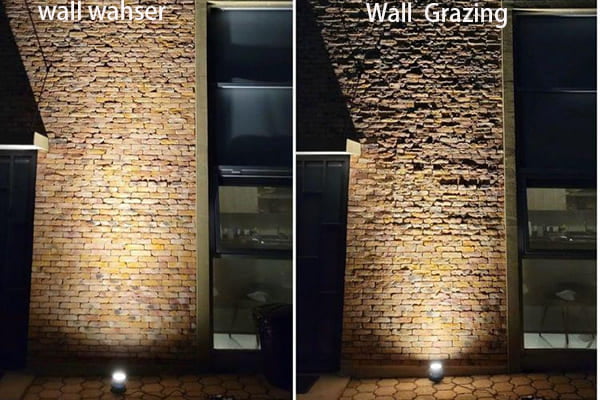
In my work, I love using warm white light to bring out the soul of certain materials. It works magic on natural textures, making them feel more authentic and present.
| Material | Effect of Warm White Light |
|---|---|
| Wood | Deepens the grain, making it look richer and warmer. |
| Brick & Stone | Emphasizes their earthy tones and solid, heavy feel. |
| Old Plaster | Softens imperfections and adds a historic, gentle glow. |
This is why it is my go-to choice for residential projects, historic building restorations, and winding garden paths. It softens sharp architectural lines and creates an undeniable sense of home and belonging.
When is daylight white the right choice for a project?
Need a space to feel modern and efficient? The wrong light can make it feel dull and uninspiring. Daylight white light projects clarity, energy, and a clean, contemporary aesthetic.
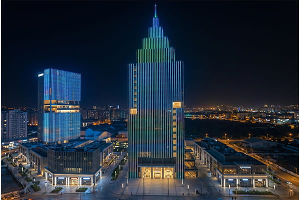
Choose daylight white (5000K-6500K) for projects needing alertness and a modern feel. It mimics midday sun, enhancing focus and making spaces feel larger. It’s perfect for office buildings, public squares, and infrastructure where functionality, safety, and a crisp aesthetic are top priorities.
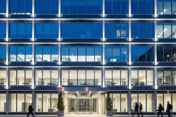
Daylight white light is the color of function and clarity. It communicates something entirely different from its warm counterpart. It speaks of rationality, order, and progress.
The Psychology of Alertness
This cool, crisp light, from 5000K to 6500K, is a psychological trigger for daytime activity. It can help increase serotonin levels in our brains, which improves mood and focus. This makes us feel more alert and awake. The clear, bright quality of the light also creates a perception of greater space and cleanliness. It strips away ambiguity and presents an environment in sharp detail. This is why it is so effective for modern glass-and-steel buildings, large public plazas, and roads. It communicates efficiency, technology, and safety to everyone who sees it.
A Surprising Regional Preference
I have noticed a fascinating trend in my work. My clients from Russia and Kazakhstan often prefer a cooler 5000K light for their projects. For a long time, I wondered why. Then it clicked when I was looking at project photos. These regions have long winters with a lot of snow. A 5000K light matches the color of snow almost perfectly. It makes snowy landscapes look pristine and crystal-clear, creating a beautiful "winter wonderland" effect. Using warm light in this context would make the pure snow look yellow and dirty. This is a perfect example of designing with the local climate and environment in mind.
How can I combine warm and cool light effectively?
Know the difference between warm and cool light? Using them together can look messy. A clear strategy using contrast and zoning is the secret to creating a stunning, layered design.
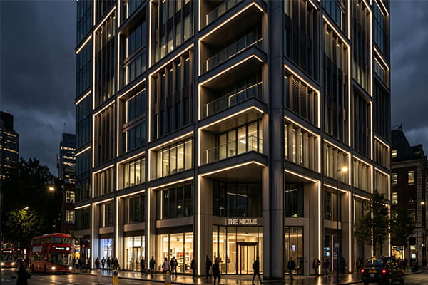
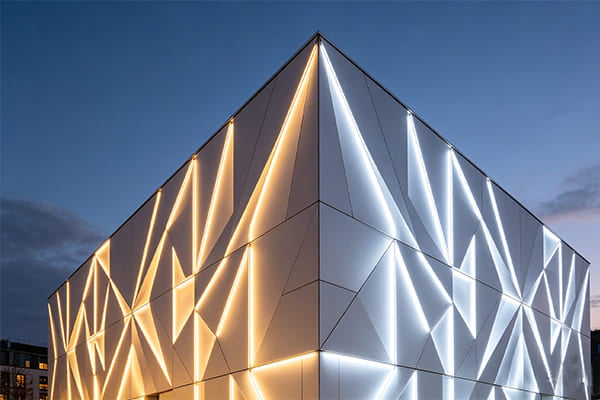
Combine them effectively by creating layers. A common professional technique is using cool light to trace a building's overall silhouette, providing structure. Then, use warm light to accent details like windows, textures, or entrances. This contrast creates depth and a sophisticated, dynamic visual experience.
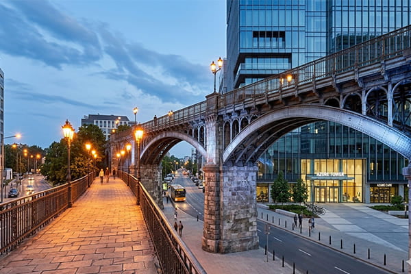
Mixing color temperatures is where lighting design becomes a real art form. It is not just about placing lights; it is about painting with them to create a scene. The goal is to create a balanced and intentional composition that guides the viewer's eye and tells a story.
Core Design Principles
I follow a few key rules to make sure the final result is powerful, not chaotic. It is about finding the right balance for human psychology, the architecture itself, and the surrounding environment. We need to respect our natural day-night cycles. This means we avoid overly bright cool light late at night, which can cause anxiety, or overly dim warm light in a functional area, which can feel depressing. A smart design considers the time of day and the purpose of the space.
Here is a simple table I use to guide my design logic:
| Design Principle | Application Strategy | Why It Works |
|---|---|---|
| Create Layers | Use cool light for outlines and warm light for details. | This creates a clear visual hierarchy and depth. |
| Match Materials | Use warm light on warm materials like wood and brick. | This enhances the material's natural character and texture. |
| Adapt to Climate | Consider warmer light in cold climates for a cozy feel. | This provides psychological comfort and balances the environment. |
By following this logic, we can create a lighting scheme that feels both visually stunning and emotionally right. It is about controlling the "psychological temperature" of the environment to make people feel exactly how you want them to feel.
Conclusion
In conclusion, color temperature is more than technical—it's emotional. Mastering the use of warm and cool light allows you to control the psychological temperature of any space you design.