Choosing the wrong light color can make a beautiful space feel uncomfortable. It can make a cozy room feel like a clinic. Understanding color temperature is the key to getting it right.
The best color temperature depends on the space's function. Use 2700K for ultimate relaxation in bedrooms. Choose 3000K for welcoming living areas. Pick 4000K for focused work in offices and kitchens. Use 5000K for high-visibility industrial and clinical spaces where clarity is critical.
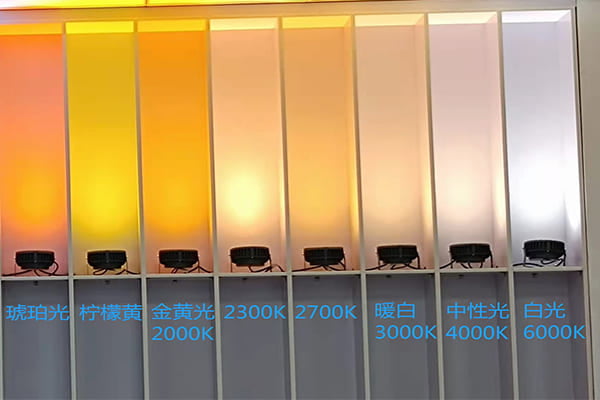
In my years of work with lighting, I've seen firsthand how color temperature, or CCT, can make or break a project. It’s measured in Kelvin (K). A low K value means the light is warm and yellow, like a sunset. A high K value means the light is cool and blue, like a bright midday sky. The choice is always a balance between what you need to do in a space and how you want to feel. Let's dive into the specifics so you can choose with confidence for your next project.
What Makes 2700K and 3000K the Go-To for Warmth and Comfort?
Your living room feels cold and uninviting. You want that warm, cozy feel but the lights are just too harsh. The right warm light can completely change the atmosphere of a room.
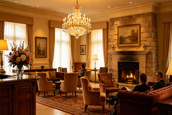
Use 2700K for the ultimate feeling of relaxation, like in bedrooms, because it mimics candlelight. Use 3000K for a balanced warmth that is still clear, which is perfect for living rooms and high-end retail stores. Both create a welcoming and comfortable environment for people.
When we talk about creating an atmosphere, we are really talking about influencing emotions with light. Warm light with low Kelvin values does this best. It feels familiar and safe.
2700K: The Ultimate Cozy Light
This is the warmest, most intimate light you can get from an LED. It looks very similar to old incandescent bulbs or even candlelight. Its deep yellow glow is incredibly relaxing. I always recommend 2700K for spaces where relaxation is the only goal. Think bedrooms, quiet bars, or luxurious hotel rooms. The warm color helps our bodies produce melatonin, the hormone that helps us sleep. For a project that needs to feel like a private retreat, 2700K is my first choice. It creates a sense of calm that cooler lights just can't match.
3000K: The "Gold Standard" for Homes
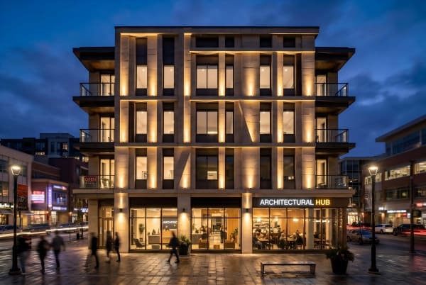
3000K is probably the most popular and versatile color temperature we sell. It’s still warm and inviting, but it has less yellow than 2700K. This makes it a bit cleaner and more vibrant. It offers a perfect balance between comfort and clarity. This is why I call it the "gold standard" for general home and hospitality lighting. It works beautifully in living rooms, dining areas, and upscale retail shops. The light is comfortable enough for socializing but clear enough to see details. For outdoor landscape lighting, 3000K is fantastic for highlighting trees, pathways, and architectural details, adding a touch of elegance.
| Feature | 2700K (Extra Warm White) | 3000K (Warm White) |
|---|---|---|
| Atmosphere | Extremely cozy, intimate, relaxing | Welcoming, comfortable, elegant |
| Best For | Bedrooms, quiet lounges, spas | Living rooms, restaurants, hotels |
| Psychology | Promotes relaxation and sleep | Creates a balanced, pleasant feel |
| Pairs With | Dark woods, plush fabrics, stone | Most interior finishes, from wood to paint |
Why is 4000K Neutral White So Popular for Modern Designs and Workspaces?
You struggle to focus in your office or kitchen. The light is either too yellow and dim or too blue and harsh. You need a light that helps you see clearly and stay alert.
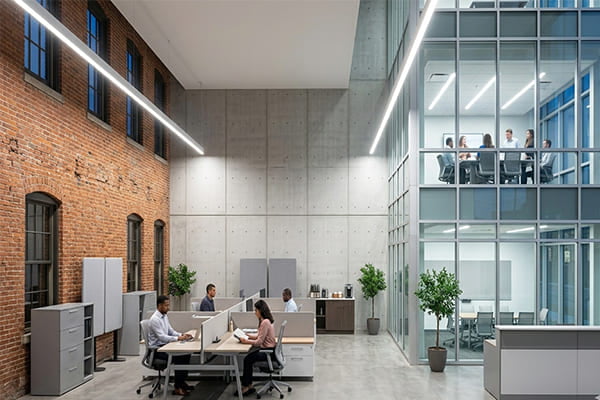
4000K is a neutral, balanced light that is very similar to natural daylight. It helps improve focus and shows colors accurately because it does not have a strong yellow or blue tint. This makes it ideal for offices, kitchens, and modern building facades.
As we move up the Kelvin scale, the light becomes less about mood and more about function. 4000K hits a sweet spot. We sometimes call it "moonlight color" because it's clear and neutral without feeling sterile. It doesn't have the warm yellow of 3000K or the sharp blue of 5000K. This neutrality is its greatest strength.
Clarity and Concentration
The main benefit of 4000K light is clarity. It renders colors very accurately, so a red apple looks truly red. This is crucial in spaces where tasks are performed. In a kitchen, it helps you see the true color of your food while you cook. In an office or study, it reduces eye strain and can help improve concentration during the day. Because it mimics natural daylight, it helps keep our minds alert and focused. I often recommend it for workspaces, garages, and any area where detailed tasks are common.
Modern Architectural Applications
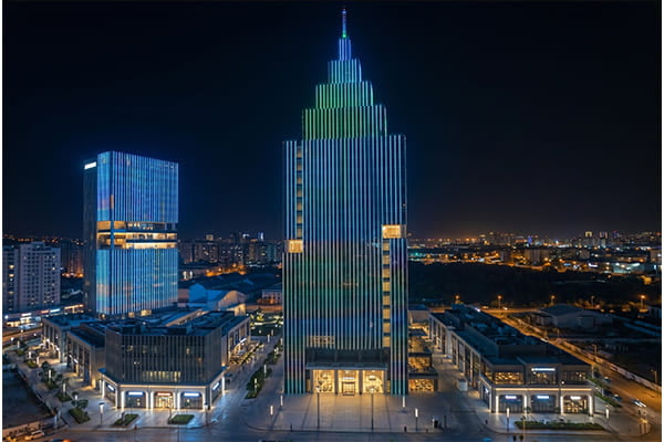
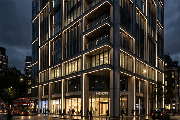
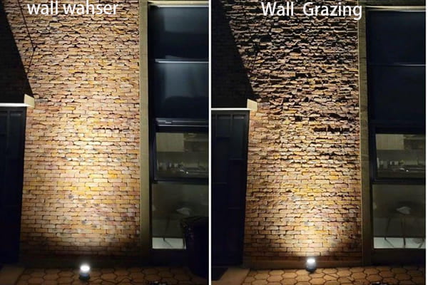
For my work at JUXUANLED, 4000K has become a favorite for modern architecture. When we light up a building facade, we often want to highlight its clean lines and materials. 4000K light works perfectly with materials like steel, glass, and concrete. It makes the structure look crisp and sophisticated. Unlike warm light, which can make a grey building look yellowish, 4000K preserves the intended color palette of the architect. Using our linear wall washers in 4000K can create a stunning, clean wash of light that makes a modern building stand out at night.
| Application | Why 4000K Works Best |
|---|---|
| Offices & Studies | Improves focus and reduces eye strain. |
| Kitchens & Bathrooms | Provides clear, task-oriented light and shows colors accurately. |
| Retail Stores | Makes products look vibrant and true-to-color. |
| Modern Facades | Highlights clean lines and cool-toned materials like steel and glass. |
When Should You Use Bright 5000K Light and What Are the Considerations?
Your project requires maximum brightness and absolute clarity. Spaces like garages, workshops, or hospitals feel dim and unsafe. You need a light that leaves no shadows and provides a sharp, clear view.
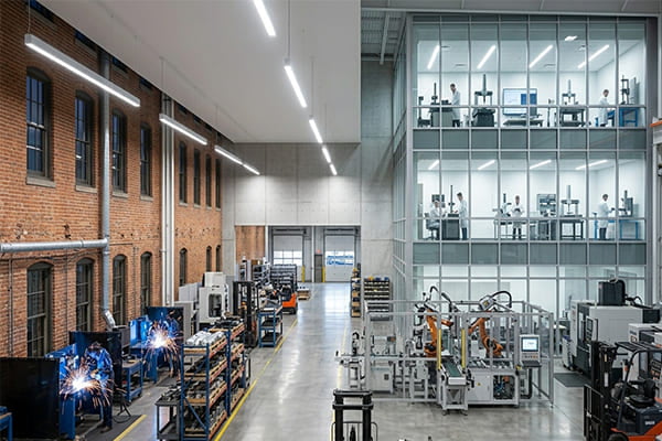
5000K and higher is a very bright, cool white light that contains a lot of blue light. It provides the sharpest visibility possible. This makes it perfect for hospitals, industrial sites, laboratories, and parking lots where precision and safety are the top priorities.
When you get to 5000K and above, you are in the realm of intense, high-energy light. This color temperature is similar to a bright, sunny day. The light is sharp, crisp, and has a distinct blueish tint. It's not designed for comfort; it's designed for performance.
Maximum Visibility and Safety
The high blue light content in 5000K light makes our eyes perceive it as brighter and more focused. This is why it is the standard for environments where mistakes are not an option. Think of hospital operating rooms, scientific laboratories, or large industrial factories. The intense brightness minimizes shadows and allows for maximum detail perception, which is critical for safety and precision. It is also excellent for large outdoor areas like parking lots and sports stadiums, where you need to illuminate a huge space clearly.
An Interesting Trend in Outdoor Lighting
While 3000K and 4000K are typical for most outdoor architectural projects, I have noticed a specific trend with some of my clients. Many of our partners in Russia, Kazakhstan, and other countries in that region specifically request 5000K for their outdoor projects. They use our 5000K linear lights, wall washers, and floodlights as the main color for building facades. My theory is that in regions with long, dark winters, the crisp, bright 5000K light creates a powerful and bold statement. It cuts through the darkness and makes buildings look incredibly prominent and strong, which is a different aesthetic goal than the subtle elegance of warmer tones.
| Use Case | Reason for 5000K+ |
|---|---|
| Hospitals, Labs | Maximum clarity for critical tasks. |
| Industrial Plants | Enhances safety and reduces errors. |
| Parking Garages | High visibility eliminates dark spots. |
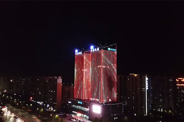
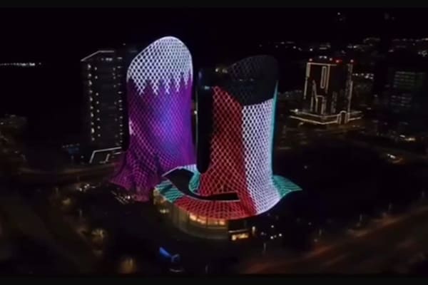
| Bold Facades | Creates a striking, high-impact visual statement. |
How Do I Mix and Match Color Temperatures Like a Pro?
You've chosen lights for different rooms, but the whole space feels messy and inconsistent. The transition from one room to another feels jarring. You need a clear strategy for a unified, professional look.
For visual harmony, keep the color temperature difference within 500K in a single open space. Use zoning: assign warm light (low K) to rest areas and cool light (high K) to work areas. You can also layer light, using a warm ambient light with a cooler task light.
Combining different color temperatures can be very effective, but it needs a plan. Randomly mixing them will look chaotic. As a lighting professional, I follow a few simple principles to ensure the final result looks intentional and beautiful. These rules help create a functional and visually pleasing environment.
1. The Rule of Visual Unity
In any single, continuous space, like an open-plan kitchen and living room, you should not mix color temperatures that are far apart. A 3000K living area flowing into a 5000K kitchen will create a jarring visual boundary. The rule of thumb I use is to keep the CCT of all general lighting in an open area within 500K of each other. For example, you can successfully combine 3000K and 3500K, but combining 3000K and 4000K can already feel a bit disconnected. Sticking to this rule creates a smooth, harmonious transition.
2. The Principle of Zoning
This is the most common and effective strategy. Assign different color temperatures to different rooms based on their function. This creates "zones" of light in your project.
- Relaxation Zones: Bedrooms, living rooms, and dens get warm light (2700K-3000K).
- Task Zones: Kitchens, bathrooms, offices, and garages get neutral or cool light (4000K-5000K). This approach is logical and aligns the lighting with the activities in each space.
3. The Technique of Layering
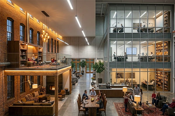
You can mix color temperatures within the same room if you do it through layering. This means you have a base layer of general (ambient) light and add other layers of light for specific tasks. For example, a home office could have 3000K ceiling lights for a comfortable overall feel, but a 4000K desk lamp for focused work. The desk lamp is only used when needed, so it doesn't clash with the room's main ambiance. This is a sophisticated way to get the best of both worlds.
| Strategy | Good Example | Bad Example |
|---|---|---|
| Unity | Open-plan space uses all 3000K lighting. | Open-plan kitchen has 4000K, living room has 2700K. |
| Zoning | 2700K bedroom, 4000K adjacent home office. | 4000K bedroom, 3000K bathroom. |
| Layering | 3000K ambient light with a 4000K reading lamp. | 3000K and 5000K ceiling lights mixed in the same grid. |
Conclusion
Choosing the right color temperature is simple. It is all about matching the light to the function and the desired mood of the space you are designing.