Choosing the wrong color temperature can ruin a project's atmosphere.1 It can make a space feel cold and sterile, or dim and unproductive.2 Understanding the difference is key to success.
For a warm, cozy feel like in hotels, use 3000K.3 For a clean, modern, and efficient look in offices or retail, 4000K is best.4 For high-visibility task areas like warehouses and factories, choose the bright, crisp light of 5000K.5
I've been in the lighting business for over a decade, and one of the most common questions I get is about color temperature. It seems simple, but it's one of the most critical decisions in any lighting project. A number on a spec sheet can completely change the way people feel and perform in a space. I remember one early project where we had to swap out every single fixture because the client felt the light was "just wrong." That costly lesson taught me how vital it is to get this right from the start. Let's break down exactly what these numbers mean and how to pick the right one every time.
What Are the Core Differences Between 3000K, 4000K, and 5000K Light?
All light can seem the same until it's installed on your project. An incorrect choice can destroy the intended mood, making a space feel completely different than you designed.
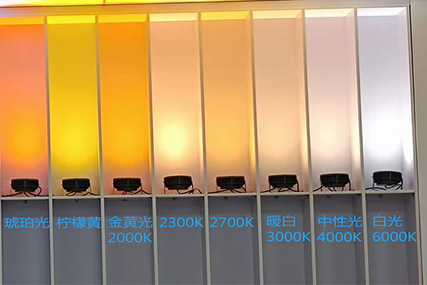
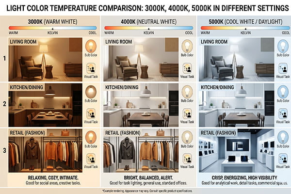
3000K is warm and cozy, like a sunset. 4000K is neutral and clear, like midday light. 5000K is bright and crisp, like an overcast sky.6 Each color temperature creates a very different psychological feeling and serves a distinct purpose.7
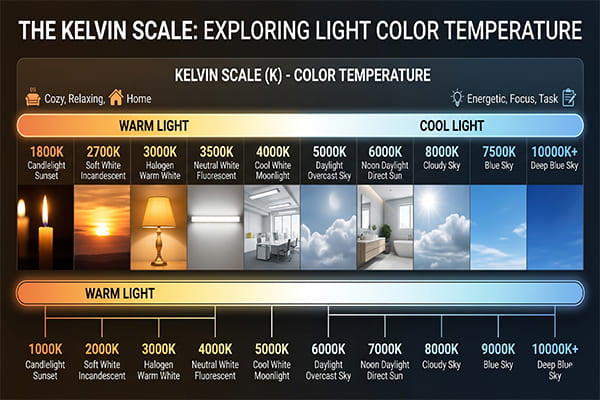
To really get this, you have to understand the Kelvin scale. Think of it as a thermometer for light color. Lower numbers are warmer and more yellow, while higher numbers are cooler and more blue.8 In my experience, clients often underestimate how much "feel" comes from the light itself. We're not just illuminating a space; we're setting a mood. I once consulted on a hotel project where the lobby was lit with 5000K fixtures. It felt like a hospital waiting room, not a luxury retreat. We recommended a switch to 3000K, and the transformation was immediate. The space became warm, inviting, and premium. That's the power of color temperature.
A Quick Comparison
| Color Temperature | Visual Description | Psychological Effect | Best For... |
|---|---|---|---|
| 3000K | Warm White (Yellowish) | Cozy, Relaxing, Inviting | Creating a sense of comfort and intimacy. |
| 4000K | Neutral White (Balanced) | Clean, Focused, Natural | Promoting clarity and alertness without being harsh. |
| 5000K | Cool White (Bluish) | Bright, Crisp, Alerting | Enhancing detail, boosting energy and concentration. |
How Do I Choose the Right Color Temperature for My Commercial or Architectural Project?
A project's success depends on getting the details right. Choosing the wrong lighting can make a stunning building look flat or a welcoming space feel cold and uninviting.
Use 3000K for hotels and historic sites to create a warm, premium feel. Choose 4000K for modern offices and retail to look clean and professional. Use 5000K for industrial sites and warehouses for maximum visibility and safety.
The function of the space is your most important guide. You wouldn't use the same lighting in a five-star hotel as you would in a factory, and the color temperature is a huge part of that. We work with contractors on a massive range of projects, from ancient building restorations to cutting-edge skyscrapers, and the lighting plan always starts with the question: "What is this space for? What do we want people to do and feel here?" Answering that question honestly points you directly to the right color temperature. Let’s look at some specific examples from my experience.
Hospitality and Historic Buildings
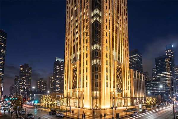
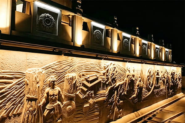
For these projects, 3000K is almost always our first choice. The warm, yellowish glow enhances the texture of materials like stone, brick, and wood. It mimics the feel of older lighting sources like gas lamps or candles, creating a sense of timelessness and luxury. This color temperature makes guests feel welcome and relaxed, which is the primary goal in hospitality.
Modern Commercial and Office Spaces
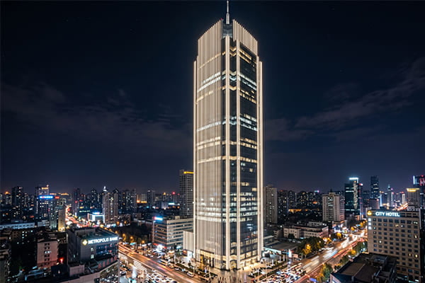
Here, 4000K is the undisputed champion. It's what I call the "workhorse" color temperature. It's clean, balanced, and professional. In retail, it provides excellent color rendering, so products look true to life.9 In an office, it helps keep employees alert and focused without the sterile feel of higher temperatures.10 For most modern building facades, 4000K provides a crisp, clean look that highlights the architecture perfectly.
Industrial and Security Applications
When safety and efficiency are the top priorities, 5000K is the answer. In factories, warehouses, and parking garages, you need bright, high-contrast light. This allows workers to see details clearly, read labels, and operate machinery safely. For security purposes, the cool, bright light of 5000K helps cameras capture clearer images and acts as a deterrent.11 Here, function is more important than atmosphere.
What About Landscape and Exterior Facade Lighting?
Your building looks fantastic during the day but completely vanishes at night. Poor lighting can hide beautiful architecture or make an area feel unsafe. Use light to paint your building.
For landscape lighting, 3000K creates a magical, natural ambiance in gardens. For modern architectural facades, 4000K is perfect for highlighting clean lines and materials. The choice depends entirely on the mood you want to create.
Lighting the outside of a building or a landscape is like telling a story without words. You guide the eye, create a mood, and can transform a simple structure into a landmark. The color of that light is one of your most powerful tools. Over the years, we've supplied lighting for countless landscape and facade projects, and the most successful ones always have a clear vision for the nighttime identity they want to create. The choice between 3000K and 4000K is central to that vision.
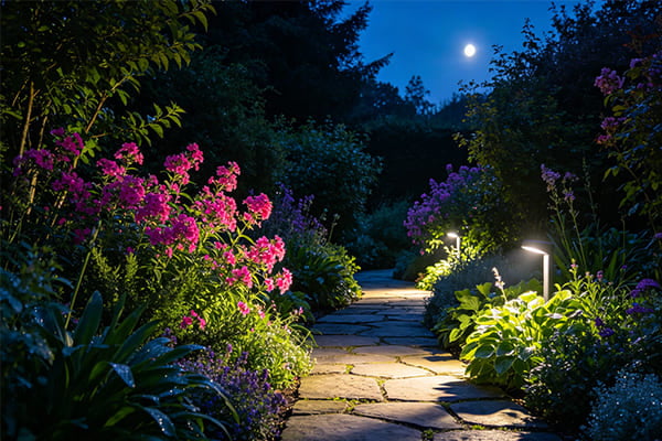
Creating Ambiance in Gardens and Landscapes
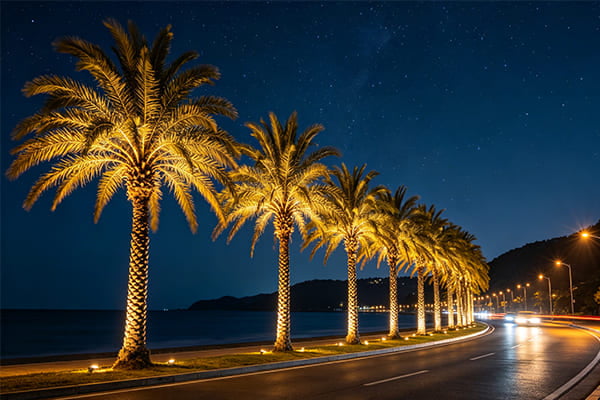
When we light natural elements like trees, plants, and stone pathways, 3000K is our go-to. Its warm tone feels organic and complements the natural colors of the landscape.12 It creates a soft, inviting glow that feels magical, not artificial. For the luxury villas and resorts we work with, 3000K wall washers and linear lights are perfect for highlighting exterior walls and creating a cozy, high-end atmosphere.
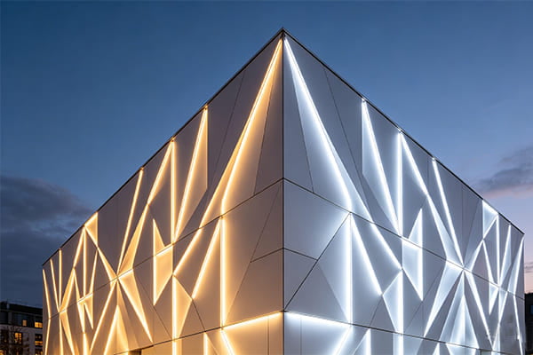
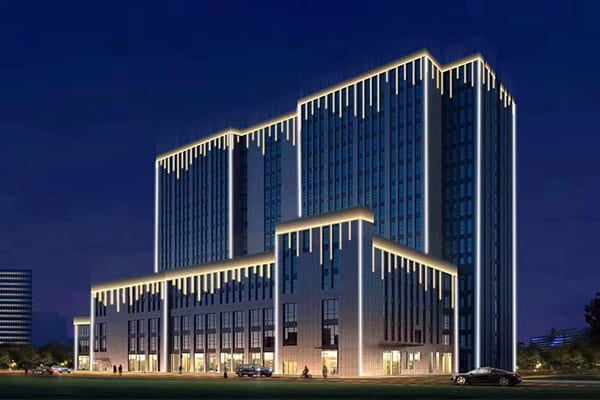
Showcasing Modern Architecture
For buildings with glass, steel, and concrete facades, 4000K is often the better choice. The neutral white light provides a clean, crisp illumination that emphasizes the structure's sharp lines and modern design. It doesn't add a yellow tint, so the building's true colors and textures are displayed accurately. It creates a look that is sleek, professional, and confident. We use our linear wall washers in 4000K for many projects along the Belt and Road to give new commercial centers a powerful and modern nighttime presence.
One final, critical piece of advice: keep your color temperature consistent. One of the biggest mistakes I see is mixing different color temperatures in the same visual area. It looks messy and unprofessional. Pick one that serves your project's goal and stick with it for a cohesive, beautiful result.
Conclusion
Choosing between 3000K, 4000K, and 5000K is about matching the light to its purpose. Use this guide to make every project shine exactly as you intended.
"The effect of high correlated colour temperature office lighting on ...", https://pmc.ncbi.nlm.nih.gov/articles/PMC1779263/. Research on lighting quality and environmental perception supports that correlated color temperature is one factor influencing perceived ambience and comfort in built spaces. Evidence role: general_support; source type: paper. Supports: Choosing an inappropriate color temperature can negatively affect the perceived atmosphere of a project.. Scope note: Such studies typically examine controlled settings and perceptions; they do not prove that color temperature alone determines a project's atmosphere. ↩
"The effect of high correlated colour temperature office lighting on ...", https://pmc.ncbi.nlm.nih.gov/articles/PMC1779263/. Studies of indoor lighting report that light level and correlated color temperature can affect subjective impressions such as warmth, comfort, alertness, and perceived suitability for work. Evidence role: general_support; source type: paper. Supports: Lighting color temperature can influence whether a space is perceived as cold, sterile, dim, or suitable for productive work.. Scope note: The evidence is strongest for perceived impressions and self-reported responses, not for every real-world space or productivity outcome. ↩
"[PDF] LED Bulbs Made Easy: Just Look for the ENERGY STAR", https://www.energystar.gov/sites/default/files/asset/document/Light%20Bulb%20Purchasing%20Guide_16Mar2020.pdf. Lighting references commonly classify approximately 3000 K as warm white light, a range associated in design guidance with hospitality and residential ambience. Evidence role: definition; source type: institution. Supports: 3000K light is commonly considered warm white and suitable for creating a cozy hospitality atmosphere.. Scope note: This supports the conventional classification and design rationale, not that 3000 K is always optimal for every hotel. ↩
"[PDF] Lighting Specification Guidance for Schools - Department of Energy", https://www.energy.gov/sites/default/files/2024-12/lighting-spec-guidance-school_nov24.pdf. Professional lighting guidance often describes around 4000 K as neutral or cool white and commonly used in offices, retail, schools, and commercial interiors where visual clarity is important. Evidence role: general_support; source type: institution. Supports: 4000K lighting is commonly used in offices and retail for a neutral, clean appearance.. Scope note: The source can support common usage and visual character, but the word “best” remains context-dependent. ↩
"1915.82 - Lighting. | Occupational Safety and Health Administration", http://www.osha.gov/laws-regs/regulations/standardnumber/1915/1915.82. Industrial lighting guidance and workplace illumination references commonly describe higher correlated color temperatures such as 5000 K as cool white/daylight-like and often used where task visibility and visual acuity are priorities. Evidence role: general_support; source type: government. Supports: 5000K lighting is commonly associated with bright, cool-white illumination used in industrial task areas.. Scope note: Visibility also depends on illuminance, glare control, uniformity, and color rendering, so color temperature alone is not sufficient. ↩
"Color temperature - Wikipedia", https://en.wikipedia.org/wiki/Color_temperature. Lighting education materials classify common CCT ranges so that about 3000 K is warm white, about 4000 K is neutral white, and about 5000 K is cool or daylight white. Evidence role: definition; source type: education. Supports: 3000K, 4000K, and 5000K correspond broadly to warm white, neutral white, and cool/daylight white categories.. Scope note: Analogies to sunset, midday, or overcast sky are illustrative and may vary with weather, location, and measurement conditions. ↩
"Effects of illuminance and correlated color temperature of indoor ...", https://pmc.ncbi.nlm.nih.gov/articles/PMC8275593/. Experimental lighting studies indicate that correlated color temperature can influence subjective impressions, mood-related responses, and perceived appropriateness of spaces. Evidence role: expert_consensus; source type: paper. Supports: Different color temperatures can produce different psychological impressions and are selected for different design purposes.. Scope note: Psychological responses vary by culture, age, illuminance, adaptation, and task, so the evidence is contextual rather than deterministic. ↩
"[PDF] A correlated color temperature for illuminants", https://nvlpubs.nist.gov/nistpubs/jres/7/jresv7n4p659_A2b.pdf. Definitions of correlated color temperature explain that lower Kelvin values correspond to warmer, yellower-white light, while higher Kelvin values correspond to cooler, bluer-white light. Evidence role: definition; source type: encyclopedia. Supports: On the Kelvin color-temperature scale, lower values appear warmer/yellower and higher values appear cooler/bluer.. ↩
"[PDF] A correlated color temperature for illuminants", https://nvlpubs.nist.gov/nistpubs/jres/7/jresv7n4p659_A2b.pdf. Lighting standards distinguish correlated color temperature from color rendering and use color-rendering metrics such as CRI or TM-30 to evaluate how accurately object colors appear under a light source. Evidence role: definition; source type: institution. Supports: True-to-life product appearance in retail depends on color-rendering performance, not only color temperature.. Scope note: A 4000 K lamp does not inherently provide excellent color rendering; that depends on the lamp spectrum and color-rendering rating. ↩
"Effects of Light on Attention and Reaction Time: A Systematic Review", https://pmc.ncbi.nlm.nih.gov/articles/PMC8957666/. Workplace lighting research suggests that cooler or neutral-white light can affect alertness and cognitive performance measures, though outcomes depend on illuminance, timing, duration, and individual differences. Evidence role: mechanism; source type: paper. Supports: Neutral-white office lighting may support alertness and focus compared with warmer or very cool lighting, depending on conditions.. Scope note: Evidence does not establish that 4000 K specifically improves alertness in all offices or that higher CCT is universally perceived as sterile. ↩
"Properties of Security Lighting - USDA Forest Service", https://www.fs.usda.gov/t-d/phys_sec/deter/props.htm. Security-lighting guidance notes that adequate illumination, uniformity, and camera spectral sensitivity affect surveillance image quality and perceived deterrence in outdoor areas. Evidence role: mechanism; source type: government. Supports: Lighting characteristics can influence surveillance-camera image quality and perceived security, though 5000K itself is not the sole factor.. Scope note: This supports the importance of lighting for camera performance and security perception, but does not prove that 5000 K specifically deters crime or always improves images. ↩
"Landscape Lighting Color Temperature Guide: Choosing the Perfect ...", https://tru-scapes.com/landscape-lighting-color-temperature-guide/. Landscape-lighting guidance commonly recommends warm-white light for many plants, stone, and residential outdoor settings because it tends to emphasize earthy tones and create a softer visual impression. Evidence role: general_support; source type: education. Supports: Warm-white lighting is often used in landscape lighting to complement natural materials and create a softer ambience.. Scope note: The effect is aesthetic and material-dependent; some landscapes or design concepts may use neutral or cooler CCT intentionally. ↩