Have you ever picked the perfect colors for a project, only to see them look dull and lifeless under the lights? You've invested time and money, but the result is disappointing.
The Color Rendering Index1, or CRI, is the key. It measures how well a light source shows the true colors of an object, using natural sunlight as the benchmark (CRI 1002). A higher CRI means colors will look more accurate and vibrant, just like they do outdoors.
Choosing the right CRI can feel complicated, but it's actually straightforward once you understand the core differences. It’s not about always picking the highest number. It's about matching the light to the job it needs to do. Getting this right is the secret to making your project look exactly as you envisioned. Let’s break it down so you can choose with confidence every time.
What's the Real Difference Between CRI 803, 90, and 95?
It's frustrating when you see a space that just feels "off" or cheap, and you can't put your finger on why. Often, it's the light quality making colors appear flat and unnatural.
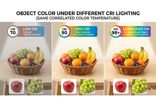
The difference between CRI 803, 90, and 95 is all about color accuracy4 and vibrancy. CRI 803 is standard, CRI 905 delivers excellent, vivid color, and CRI 956 offers professional-grade, near-perfect color fidelity7. Each level creates a distinct visual experience8 for your space.
Let's dive deeper into what these numbers actually mean for how things look. I’ve had clients who were amazed at how a simple switch from CRI 803 to CRI 905 transformed their space from looking average to feeling high-end. The difference is not subtle once you see it. It affects everything from skin tones to the texture of materials. To make it clearer, I've put together a simple table that breaks down the visual feel and common issues with each level. This will help you see why a higher number isn't always better, but the right number is crucial.
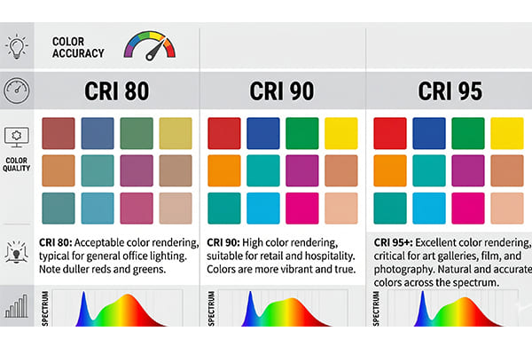
| Metric | CRI 803 (Standard) | CRI 905 (High CRI) | CRI 956+ (Professional) |
|---|---|---|---|
| Color Fidelity | Good, meets basic visual needs. | Excellent, colors are rich and vibrant. | Flawless, almost no color distortion. |
| Common Pain Point | Weak performance on deep reds (R9). | Balanced performance, great for most uses. | Higher cost, slightly lower efficiency. |
| Visual Feel | Colors can seem a bit flat or washed out. | Colors are true, skin tones look healthy. | Details and textures are sharp and clear. |
With CRI 803, you might notice that reds look a bit brownish and skin tones can appear pale. It gets the job done for basic visibility, but it lacks warmth and richness. When you step up to CRI 905, everything comes to life. Colors are saturated, wood grains look richer, and people look healthier. CRI 956+ takes it to another level. It’s for situations where every single shade matters. Think of a museum trying to show a painting exactly as the artist intended. The light has to be perfect, and that’s what CRI 956+ delivers.
How Do I Choose the Right CRI for My Project?
Choosing the wrong CRI can be a costly mistake. You might overspend on high-CRI lights for a warehouse, or you could under-deliver on quality for a high-end retail9 store.
It’s simple: match the CRI to your project’s main goal. Use CRI 803 for efficiency, CRI 905 for atmosphere and quality, and CRI 956+ for precision work where color accuracy4 is everything. This ensures you get the best result without wasting your budget.

I always tell my clients to think about the purpose of the space first. The "best" CRI is the one that best serves that purpose. You wouldn't use the same tires on a race car that you'd use on a farm tractor. Lighting is no different. Let's look at some real-world scenarios to make this crystal clear.
Tier 1: CRI 803 for Cost and Efficiency
This is the most widely used level of CRI today, and for good reason. It offers a great balance of decent color quality, high light output (lumens per watt), and a lower price point. For many projects, this is the smart choice.
- Best for: Road lighting, general landscape lighting, warehouses, parking garages, and standard office spaces.
- Why: In these applications, the main goal is visibility and safety, not perfect color rendering10. You need to see if there's a box in the aisle or a car in the garage. You don't need to see the subtle shades of red on the box. Prioritizing higher light efficiency11 and lower purchasing costs makes the most sense here.
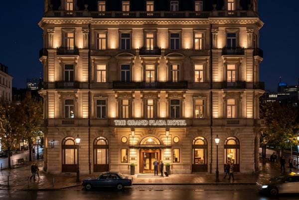
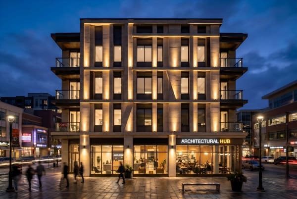
Tier 2: CRI 905 for Atmosphere and Comfort
This has become the go-to standard for any project where ambiance and quality perception matter. The jump in visual quality from CRI 803 to 90 is significant and immediately noticeable.
- Best for: Hotel lobbies, high-end residences, restaurants, and retail chain stores.
- Why: CRI 905 makes a space feel more luxurious and inviting. I remember a restaurant client who was worried their food didn't look appealing enough in photos. We switched their lighting to CRI 905, and suddenly the dishes looked vibrant and delicious. In homes, it makes wood furniture look richer and skin tones appear healthier and more natural. It’s a small investment that pays off big in customer experience.
Tier 3: CRI 956+ for Precision and Perfection
This is the top tier, reserved for specialized fields where color accuracy4 is not just a preference but a professional requirement.
- Best for: Museums, art galleries, high-end jewelry stores, operating rooms12, and professional photography studios.
- Why: In these settings, a small color shift can be a major problem. For an art gallery, a CRI 956+ light ensures that visitors see the exact colors and brushstrokes the artist used. In a jewelry store, it reveals the true fire and sparkle of diamonds and gemstones. Any less, and you risk misrepresenting the product or the art.
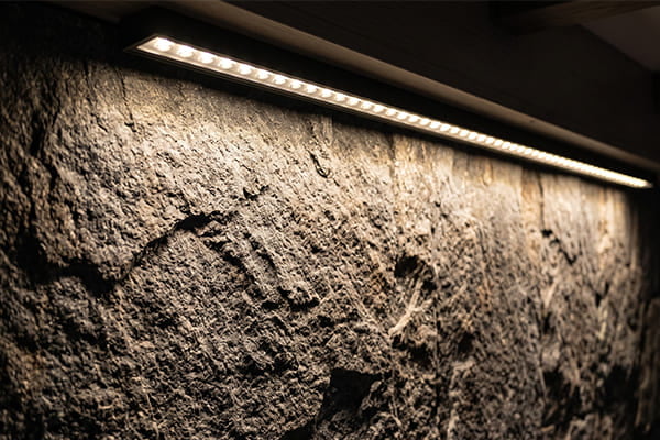
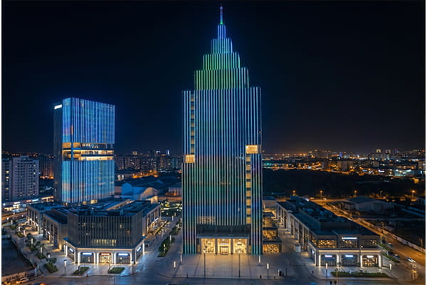
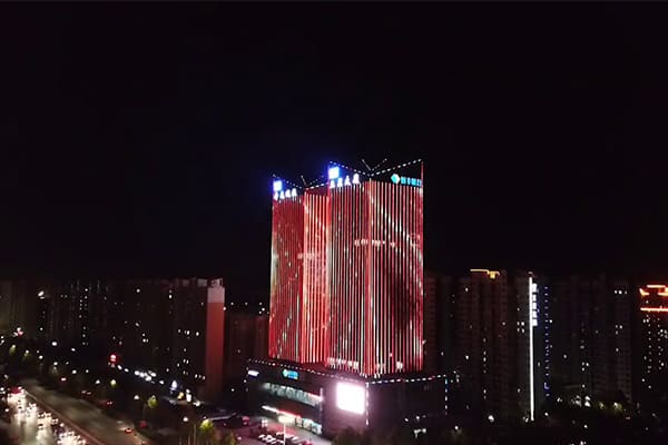
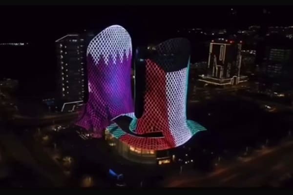
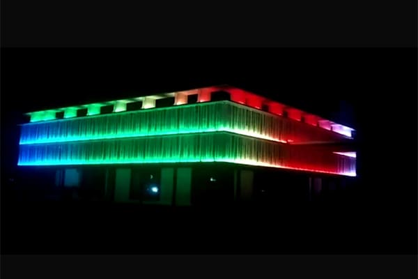
Why is the CRI so Low on Outdoor Lights like Linear and Wall Washer Lights?
A lot of my clients ask me, "Happy, if CRI 905 is the standard for quality indoors, why do the outdoor linear lights, pixel lights, and wall washers you sell have a CRI of 70 or even lower?"
It’s a great question. The simple answer is that outdoor lights13 are designed for different goals. We intentionally trade some color accuracy4 for higher brightness, specific color effects, and long-term durability in harsh environments. It's a calculated engineering decision, not a sign of low quality.
When you are lighting a 30-story building, your priorities are very different from when you are lighting a kitchen. You're dealing with massive scale, long viewing distances, and extreme weather. Let's break down the technical reasons why outdoor facade lighting often has a lower CRI.
1. The Trade-Off for Brightness
First, there's a trade-off between CRI and light efficiency11. For the same amount of power, a CRI 905 LED chip is typically 15-25% less bright than a CRI 70 chip. This is because creating high-quality, full-spectrum white light requires more complex and less efficient phosphors. For a wall washer that needs to throw light hundreds of feet up a building, or a linear light that needs to be seen from across a river, maximizing lumen output is critical. We often have to sacrifice some CRI to get the sheer power needed to make the building visible and bright.
2. The Nature of RGB Light
Second, many outdoor fixtures use RGB (Red, Green, Blue) or RGBW (Red, Green, Blue, White) LEDs to create dynamic color-changing effects. The CRI scale was designed to measure "continuous spectrum" light, like sunlight or an incandescent bulb. RGB fixtures create white light by mixing three single colors. This creates a "broken" spectrum that is missing many shades in between, like cyan and yellow. Even if the light looks white to our eyes, a CRI meter will read it as very poor, often as low as 20-40. So for color-changing lights, CRI is not even a relevant metric.
3. Viewing Distance and Perception
Third, think about how we view outdoor lighting. We're usually looking at a building's outline, a bridge's structure, or a landscape feature from far away. From a distance, our eyes are not sensitive to fine color details. We are more interested in the overall color saturation, the patterns, and the dynamic movement of the light. The primary goal is to create a visual impact on a large scale, not to perfectly render the color of the bricks on the building wall. High CRI is simply not needed for this application.
4. Durability in Harsh Environments
Finally, outdoor fixtures have to survive in tough conditions like extreme heat and direct sunlight. The phosphors used to create high-CRI light can sometimes degrade faster than standard phosphors, especially under high temperatures. As a manufacturer, we need to guarantee our products for 3 to 5 years or more. To ensure long-term stability and reliability, we often choose the more robust and proven low-CRI LED solutions that are better suited for the demanding outdoor environment.
Is a CRI of 100 Always the Perfect Light Source?
People often assume that since 100 is the highest score, a light with CRI 1002 must be the absolute best. I get asked this a lot, but it’s a common misunderstanding.
A CRI of 100 does not mean "perfect light." It simply means the light source is a perfect match to a specific standard reference light. The real question is whether that reference light is the ideal one for your specific needs.
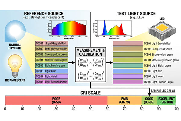
Let's dive a little deeper into what CRI 1002 actually means. The CRI system works by comparing a light source to a "perfect" reference source of the same color temperature14. But what is this reference source? For warmer color temperature14s (below 5000K), the reference is an incandescent bulb. For cooler color temperature14s (above 5000K), the reference is a scientific model of natural daylight.
So, when a light has a CRI of 100, it just means its spectrum is identical to that of an incandescent bulb or a specific phase of daylight. It doesn't mean it's the most desirable light for every situation. For example, an incandescent bulb has a CRI of 100. It renders colors perfectly... like an incandescent bulb does. It's very strong in reds and yellows but weak in blues. Is that the "perfect" light for an office or a hospital? Probably not. You might want a more balanced spectrum that feels cleaner and more alert.
The idea of a "perfect" light source is subjective. It depends entirely on your goal. If you want to create a cozy, warm, intimate atmosphere in a restaurant, a light that mimics an incandescent bulb (CRI 1002) might be perfect. But if you are a painter trying to see true colors in your studio, you might prefer a light that perfectly mimics noon daylight (also CRI 1002, but a completely different light quality). So, a CRI of 100 just means you've perfectly replicated a standard. The key is to first decide which standard is the right one for you.
Conclusion
Choosing the right CRI is all about matching the light to your project's goal. Use CRI 803 for efficiency, 90 for great atmosphere, and 95+ for perfect color precision.
Understanding CRI is essential for selecting the right lighting to enhance color accuracy in your projects. ↩
Learn about CRI 100 and how it serves as a benchmark for color accuracy in various lighting applications. ↩
Discover why CRI 80 is a popular choice for general lighting needs and its advantages. ↩
Explore the significance of color accuracy in lighting and its impact on visual experiences. ↩
Find out how CRI 90 enhances the atmosphere in spaces like restaurants and homes. ↩
Understand the critical role of CRI 95 in settings where color precision is paramount. ↩
Learn about color fidelity and its importance in achieving true-to-life color representation. ↩
Explore how different CRI levels influence the overall visual experience in various environments. ↩
Discover the ideal CRI for high-end retail environments to enhance product presentation. ↩
Understand the concept of color rendering and its impact on visual quality in lighting. ↩
Explore the concept of light efficiency and its significance in lighting design. ↩
Explore the importance of high CRI lighting in operating rooms for accurate color perception. ↩
Understand the reasons behind lower CRI ratings in outdoor lighting and their intended purposes. ↩
Understand the relationship between color temperature and CRI in lighting choices. ↩