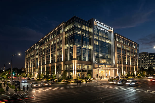
Your hotel's facade looks dull at night, failing to make a powerful first impression. This can make your brand feel less prestigious and turn away discerning guests before they even step inside.
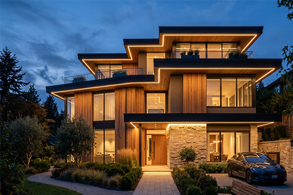
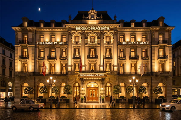
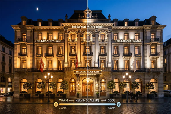
Yes, 3000K warm white light1 is the secret to creating a grand, luxurious hotel entrance. This specific color temperature produces an inviting "golden white" glow2 that perfectly highlights premium materials like marble and brass, setting a sophisticated tone without being too stark or old-fashioned.
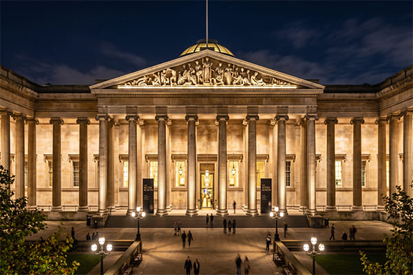
A guest's experience begins the moment they see your hotel from the street. That first glance is your only chance to communicate luxury, elegance, and a sense of welcome. The lighting you choose is the language you use to tell that story. It’s about more than just visibility; it’s about crafting an emotion and a sense of arrival. Let's explore how we use light to build that unforgettable "grand entrance" experience.
Why is 3000K Color Temperature the Gold Standard for Luxury?
Choosing the wrong light color can ruin a multi-million dollar facade. It can make expensive materials look cheap, cold, or just plain dated, completely undermining the feeling of luxury you want to create.
3000K color temperature hits the perfect balance for luxury. It is warm enough to feel welcoming but avoids the overly yellow, almost vintage feel of 2700K.3 It also steers clear of the cold, industrial sterility of 4000K light4, creating a sophisticated and inviting atmosphere.
In my years as a lighting project specialist, I've seen firsthand how color temperature can make or break a design. It’s not just a technical specification; it’s about creating a feeling. The goal for a luxury hotel is to make guests feel special, like they have arrived somewhere important. 3000K light is our most powerful tool for this.
The Emotional Impact of Light
Light directly influences human emotion.5 Think about the cozy, intimate feeling of a room lit by a 2700K bulb—it’s great for a lounge, but on a grand facade, it can appear dim and lack impact. Now, picture the crisp, bright light of an office, often 4000K or higher. It promotes alertness6, but it feels impersonal and cold. 3000K sits in that perfect middle ground. It delivers a clean, modern warmth that feels both elegant and welcoming. It says "this is a high-class establishment, but you are welcome here."
Highlighting Premium Materials
Luxury architecture relies on high-quality materials. Marble, granite, brass, bronze, and rich woods are all chosen for their texture and color. The wrong light can wash these colors out or give them an unnatural tint.7 3000K light has a wonderful ability to bring out the natural warmth and richness of these materials.8 It makes brass glow, gives marble a soft, lustrous sheen, and enhances the deep tones of stone. This creates what I call a "golden white" visual effect—a look that is synonymous with understated luxury.
| Color Temperature | Effect on Materials | Overall Feeling |
|---|---|---|
| 2700K | Very yellow, can make some stones look aged or dirty. | Cozy, nostalgic, but can feel dim. |
| 3000K | Enhances warmth in stone and metals, clean and rich. | Luxurious, welcoming, sophisticated. |
| 4000K+ | Cool, bluish tint, can make materials look flat and cold. | Modern, sterile, industrial. |
How Do You Use Light and Shadow to Build a 3D Narrative?
Many people think creating a grand entrance just means making it bright. They blast the facade with floodlights, but this creates a flat, boring look with no depth or architectural character at all.
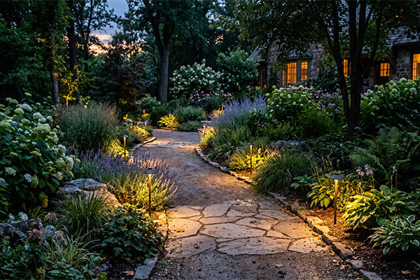
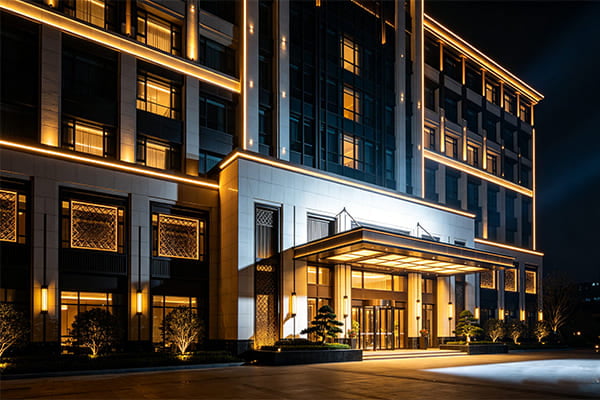
True grandeur comes from the careful layering of light and shadow.9 We use a "Point, Line, Plane" strategy: use narrow "point" lights for columns, "line" lights to guide the eye, and soft "plane" lighting to set the base mood. This carves the building out of the darkness.
A building's facade is not a flat canvas. It has depth, texture, and a story to tell. Our job in lighting design is to be the narrator. We don't just illuminate; we use light to emphasize the best features and create a visual journey for the guest, leading them from the street to the front door. I once worked on a project where the architect was worried our lighting plan was too subtle. But when we turned it on, he saw that by leaving some areas in shadow, the lit features became ten times more dramatic. That is the power of a layered approach.
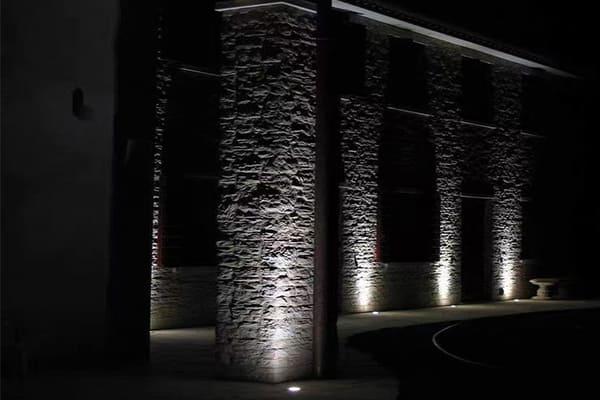
Point Lighting: Creating Focal Points
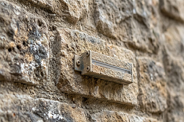
This is where we add the drama. We use fixtures like spotlights with very narrow beam angles, often between 5 and 15 degrees. We aim them to "graze" up the side of columns or pillars. This technique creates a sharp contrast of light and shadow, highlighting the texture of the material10 and making the columns look incredibly tall and majestic. We also use point lighting to draw attention to key elements like the hotel logo, intricate sculptures, or relief carvings. These become the stars of the show.
Line Lighting: Guiding the Guest's Journey
Next, we define the building's form. We use linear LED fixtures, often recessed so the fixture itself is invisible. We place these along strong architectural lines—underneath a canopy, along the edge of a roofline (the cornice), or framing a large window. These continuous lines of light do two things. First, they outline the shape of the building against the night sky. Second, they act as visual guideposts11, creating a clear and elegant path that directs a person's gaze straight to the main entrance.
Plane Lighting: Setting the Overall Mood
Finally, we tie everything together with a base layer of light. This is the "plane." We use wall washer fixtures to cast a soft, even light across the main surfaces of the facade. The goal here is not to create drama but to reduce harsh shadows and dark spots. This ensures the building doesn't look like it has holes in it. This gentle wash of light provides a context for the more dramatic point and line elements, making the entire facade feel cohesive, complete, and breathable.
| Lighting Layer | Fixture Type | Purpose |
|---|---|---|
| Point | Spotlights (5°-15°) | Add drama, highlight columns, logos, art. |
| Line | Linear Lights | Define shape, guide the eye to the entrance. |
| Plane | Wall Washers | Provide a soft base, reduce harsh shadows. |
What Technical Standards Ensure a Flawless Guest Experience?
You can have a great design, but if guests are blinded by glare or the colors look wrong, the luxury effect is lost. Visible fixtures and poor-quality light make a space feel cheap and uncomfortable.
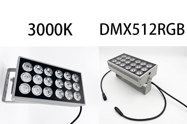
The ultimate goal is to "see the light, not the lamp." This requires high Color Rendering Index (CRI >80) for true colors and anti-glare features like honeycomb louvers. Smart DMX512 controls then allow for dynamic scenes (e.g., late-night, festive), creating a living facade.
In high-end projects, the technical details are everything. The guest shouldn't have to think about the lighting; they should just feel its effect. This means we are obsessed with visual comfort and quality. Every fixture we select and every angle we set is designed to contribute to a seamless, premium experience. It's about hiding the mechanics so the magic can shine through.
The "See the Light, Not the Lamp" Principle
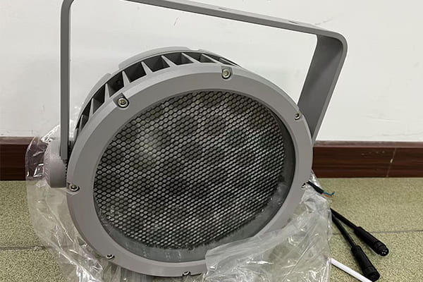
This is our fundamental rule. A guest looking at the building should never be blinded by a direct view of a light bulb. Glare is the enemy of comfort and luxury.12 To achieve this, we use fixtures with deep-set LEDs, built-in shields, and accessories like honeycomb louvers or baffles. These elements control the light beam precisely, putting light exactly where we want it on the building, and nowhere else—especially not in the eyes of an approaching guest. This meticulous control is what separates professional lighting from amateur work.
Color Rendering Index (CRI): The Key to True Colors
Have you ever seen an expensive car under a cheap streetlight and noticed its color looks strange and dull? That's the effect of a low Color Rendering Index (CRI). CRI is a scale from 0 to 100 that measures how accurately a light source reveals the true colors of an object. For luxury hotels, we insist on a CRI of 80 or higher, and often push for 90+. This ensures that the beautiful tones of the stone facade, the vibrant colors of a floral arrangement, and even the skin tones of the guests look natural and rich. It’s a subtle but critical detail for maintaining a high-end feel.
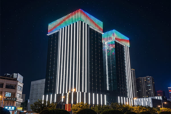
Smart Controls for a Living Facade
Static lighting is a thing of the past. A modern luxury hotel needs lighting that can adapt. We use smart control systems like DMX512 to program different lighting "scenes."
- Arrival Scene (Evening): A bright, vibrant, and welcoming display as most guests check in.
- Late-Night Scene (After Midnight): A more subtle, subdued setting that saves energy while maintaining an elegant presence.
- Festive Scene (Holidays/Events): A dynamic, colorful, or celebratory program that can be activated for special occasions.
This ability to change the mood makes the building feel alive and responsive. The lighting is no longer just a utility; it becomes an interactive part of the hotel’s brand and a language to communicate with its guests.
Conclusion
Creating a grand hotel entrance is an art. By using 3000K light, masterful layering, and flawless technical standards, we transform static architecture into an unforgettable experience from the very first glance.
"Understanding LED Color-Tunable Products Text-alternative Version", https://www.energy.gov/cmei/ssl/understanding-led-color-tunable-products-text-alternative-version. A lighting-science reference defines correlated color temperature and identifies approximately 3000 K as a warm-white range, supporting the article’s characterization of the light as warm rather than neutral or cool. Evidence role: definition; source type: education. Supports: 3000K warm white light creates a warm, inviting visual effect appropriate for hotel facade lighting.. Scope note: This supports the technical classification of 3000 K, not the broader claim that it is universally the best choice for luxury hotel entrances. ↩
"Effect of warm/cool white lights on visual perception and mood in ...", https://pmc.ncbi.nlm.nih.gov/articles/PMC8481791/. A source on correlated color temperature and human perception of light color supports that lower CCT white light is commonly perceived as warmer or more yellow than higher CCT light. Evidence role: mechanism; source type: research. Supports: 3000K light produces a warm white appearance that can be described as inviting or golden compared with cooler white light.. Scope note: The phrase “golden white” is a design description; evidence can support the warm/yellowish perception of 3000 K but not the exact aesthetic label. ↩
"Understanding LED Color-Tunable Products | Department of Energy", https://www.energy.gov/cmei/ssl/understanding-led-color-tunable-products. A comparative lighting reference explains that 2700 K is typically categorized as very warm white while 3000 K is still warm white but less yellow, contextualizing the article’s comparison. Evidence role: definition; source type: institution. Supports: 3000K is warmer than neutral white but generally less yellow than 2700K.. Scope note: The emotional terms “welcoming” and “vintage” are interpretive design judgments rather than directly standardized categories. ↩
"Standard illuminant - Wikipedia", https://en.wikipedia.org/wiki/Standard_illuminant. A lighting reference classifies around 4000 K as neutral or cool white relative to 2700–3000 K sources, supporting the contrast between warmer facade lighting and cooler white light. Evidence role: definition; source type: education. Supports: 4000K light appears cooler or more neutral than 3000K warm white light.. Scope note: The characterization as “industrial sterility” is an aesthetic interpretation; the source would support the cooler appearance, not the value judgment. ↩
"Effects of illuminance and correlated color temperature of indoor ...", https://pmc.ncbi.nlm.nih.gov/articles/PMC8275593/. Peer-reviewed environmental psychology or lighting research reports associations between lighting characteristics, such as illuminance and color temperature, and affective responses or mood ratings. Evidence role: expert_consensus; source type: paper. Supports: Lighting conditions can influence human emotional or affective responses.. Scope note: Most studies examine controlled interiors or laboratory settings, so the evidence is contextual rather than direct proof for hotel facades. ↩
"Effects of Light on Attention and Reaction Time: A Systematic Review", https://pmc.ncbi.nlm.nih.gov/articles/PMC8957666/. Research on light exposure and alertness supports that brighter or higher-CCT light can increase subjective alertness or physiological arousal under certain conditions. Evidence role: mechanism; source type: paper. Supports: Cooler or brighter light conditions, often associated with office lighting, can promote alertness.. Scope note: Evidence is often based on indoor, circadian, or laboratory exposure studies and may not directly apply to exterior hotel facade lighting. ↩
"Color rendering index - Wikipedia", https://en.wikipedia.org/wiki/Color_rendering_index. A lighting-quality source explains that a light source’s spectral power distribution and color-rendering properties affect how object colors appear under illumination. Evidence role: mechanism; source type: research. Supports: Light source characteristics can alter the perceived color and richness of facade materials.. Scope note: The source would support the mechanism of color distortion generally, not evaluate the specific hotel materials named in the article. ↩
"Impact of color temperature and illuminance of ambient light ...", https://pubmed.ncbi.nlm.nih.gov/38014704/. A source on color temperature and color rendering can support that warm-white light emphasizes warm hues in materials, while accurate color appearance also depends on spectral distribution and CRI. Evidence role: general_support; source type: research. Supports: Warm-white lighting can enhance the perceived warmth of materials such as stone, metal, and wood.. Scope note: The source would provide contextual support; it would not prove that 3000 K is optimal for every marble, brass, stone, or wood finish. ↩
"[PDF] Lighting Depth", https://www.engr.psu.edu/ae/thesis/portfolios/2008/amw304/assignments/Walker%20Lighting%20Depth.pdf. Architectural lighting guidance describes layered lighting and contrast as methods for revealing form, depth, hierarchy, and visual interest in built environments. Evidence role: expert_consensus; source type: institution. Supports: Layering light and shadow is a recognized architectural lighting strategy for creating depth and visual emphasis.. Scope note: The evidence supports the design principle of layering and contrast, while “grandeur” remains a subjective aesthetic outcome. ↩
"LED Grazers | Architectural Wall Grazing LED Fixtures - QTL Lighting", https://www.qtl.lighting/products/linear-led-grazers/. Architectural lighting references explain that grazing light placed close to a textured surface increases shadows and reveals surface relief, supporting the described effect on columns and facade materials. Evidence role: mechanism; source type: education. Supports: Grazing light can emphasize surface texture by creating strong light-shadow contrast.. Scope note: The effectiveness depends on fixture placement, beam angle, surface relief, and viewing position. ↩
"Visual attention allocation between social and navigational cues ...", https://pmc.ncbi.nlm.nih.gov/articles/PMC12929869/. Wayfinding and environmental-design research supports that lighting can function as a visual cue, helping direct attention and movement through built environments. Evidence role: general_support; source type: paper. Supports: Linear lighting can help guide visual attention toward an entrance.. Scope note: The source would support lighting as a wayfinding cue generally, not necessarily the specific use of linear LEDs on hotel facades. ↩
"Glare | Department of Energy", https://www.energy.gov/cmei/ssl/glare. Lighting standards and visual-comfort research identify glare as a cause of visual discomfort or reduced visibility, supporting the article’s emphasis on glare control in high-quality lighting design. Evidence role: expert_consensus; source type: institution. Supports: Glare reduces visual comfort and should be controlled in quality architectural lighting.. Scope note: The source supports the comfort and visibility aspect of glare; the association with “luxury” is a design inference. ↩